一つのグラフに二つのグラフを同時に表示したものを複合グラフとか2軸グラフと呼びます。
Matplotlibでも複合グラフを書く方法があります。
これについてまとめます。
ポイントは主、従の二つの軸を設定することです。
あとのそれぞれの設定は通常のグラフと同じです。
fig, ax1 = plt.subplots()
ax2 = ax1.twinx()
ax2 = ax1.twinx()
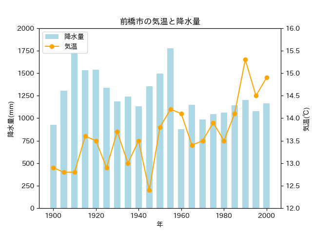
例として前橋市の降水量と気温の複合グラフを描いてみます。
import pandas as pd
import matplotlib.pyplot as plt
import japanize_matplotlib
# 1900年から2000年まで5年間隔
s = 1900
e = 2000
y = 5
# データ読込。
filename = "maebashi.csv"
df = pd.read_csv(filename, sep = ",")
df = df.set_index("年")
# データの範囲を絞る。
df = df[df.index >= s]
df = df[df.index <= e]
df = df[df.index % 5 == 0]
# 複合グラフ(2軸グラフ)用のデータ
nen = df.index
kosui = df["降水量"]
kion = df["気温"]
# ax1を主、ax2を従に。
fig, ax1 = plt.subplots()
ax2 = ax1.twinx()
# 降水量を左の軸に。色と太さを指定。
ax1.bar(nen, kosui, color = "lightblue", label = "降水量", width = 3.0)
# 気温を右の軸に。色とマーカーを指定。
ax2.plot(nen, kion, color = "orange", label = "気温", marker = "o")
# タイトルとラベルを指定。
ax1.set_title("前橋市の気温と降水量")
ax1.set_xlabel("年")
ax1.set_ylabel("降水量(mm)")
ax2.set_ylabel("気温(℃)")
# 複合グラフの凡例。
handler1, label1 = ax1.get_legend_handles_labels()
handler2, label2 = ax2.get_legend_handles_labels()
ax1.legend(handler1 + handler2, label1 + label2, loc = "upper left")
# 縦軸の範囲。
ax1.set_ylim(0, 2000)
ax2.set_ylim(12, 16)
plt.show()

コメント